Friday, April 24, 2015

ManSpider-low poly character


Here is the low resolution model for the last project. Here I had to decided on which of the two high res models It will  be based on, and I chose the man spider. The reason why I picked this one is because it was challenging, Im a huge spiderman fan, therefore I wanted to have a go at texturing it. The body is 5936 polys, the suit is 3422, together making it 20526 polys, which isn't too bad.


I began with the major part of the model, the body. Taking a decimated model from zbrush, I made it "Live" and began creating the low poly model with "add quad" tool, which is very fun to use. The tricky part was the topology. I didn't think about it enough therefore I had troubles with it. I tried to make it flow with the muscles  to deform nicely if animated.

Here is a close up of the face. I made the edge loops around the mouth, the neck, and eyes like with a regular humanoid model.

Creating the low poly version of the suit was tricky, because of the rips at the edges. I tried to keep it low and at the same time getting every sharp edge covered.
here you can see the topology overall. It seems like the body is "bleeding" through the suit , however it is just a maya bug.


 Here is fully textured suit and character. It was really tricky to make. I began with the suit, as this is the most recognizable thing about Spiderman. I decided to do it inside Zbrush to have more control than doing it inside photoshop. After doing the red and blue, I switched to photoshop to create the black lines/webbing as it was easier this way. Then I went back to Zbrush to fix the issue with lines not matching. I'm quite happy with the results, however it seems too flat. If I had more time I would create a better normal map for the webbing to make it stand out more.

Before exiting Zbrush I masked out the blue area and then applied a noise filter to the red part. I used a hexagon texture (to the left) to give it a spandex look like in the movies, to add a bit more realism.


Hexagon texture applied to the red area


For the body texture I went back to Zbrush. I applied a gray colour to the whole mesh, and went from there. By adding a darker gray in certain areas it gave an illusion of density/shadow. I used a fur alpha in some areas to give it some variation.

Texture for the claws was done in Photoshop. A basic color over the uvs was enough.
Overall im quite happy with the results. It turned out better than I thought. If I managed my time better this model would turn out better than this. Near the end I rushed and skipped few ideas I had like better webbing, different UV layout and so on. Also I could improve on the topology which isn't too bad  but it isn't too great as well; like adding better loops around the shoulders and neck. Here are the final results.


ManSpider- High Poly Model P2

After the sketching and research I was ready to start the modelling. As usual i began with creating a sphere and dynameshing it; this way I feel more flexible in terms of sculpting. This character is quite complex, lots of things go into it, so I wasn't sure where to start. I began by creating the torso, but then it wasn't going too well, so I switch to creating the head. The head came out easier and quickly I was happy with the results


Next I expanded the body to the legs. The proportions are really off here, but it doesn't matter, all I cared about is to make the character come together, make him look like the character I'm doing (right here it looks like a Halloween costume)


When I was fairly happy with the arms I duplicated them twice and then dynameshed with the torso. This way I saved a lot of time. However as you can see the proportions are still off, and the arms are getting shorter.

 Here I rejoined the arms, fixing the lenght and proportions. The character comes together more and more.  Based on my previous test sculpts, I knew how I want to join the arms with the rest of the anatomy. Also I added the claws (dynameshed sphere)  Which then will get mirrored to the other side.

 Here I increased the head sized, and pulled the chest sideways to make him look more muscular.  The legs are still too thin
 Moving on fixing the proportions and adding more definition.
 Here at this point I created the suit. I did it by masking a part of the body, then extruding the mask selection, this way the suit fits in with the body. I've re did it about 4 times as I kept making mistakes, like not masking a spot resulting in a hole. Here Also I added the feet (dynameshed sphere) which are separate to the model. Using the snake hook, pinch, and grab tool I made the suit look ripped on the edges.
Here I did the suit again as it was slightly off previously. I added more muscle definition, and fixed the proportions, like making him taller. Then I dynamesh the body and the feet together as it would be easier to make the uvs, and not worry about the hiding gap between the feet and the legs.


Here is  the final result. Overall I think im quite happy with it! However I know I really could improve on time managment. I focused to much on a different project, and therefore got behind with this one. Also to improve it I know I could push the details further, especially for the suit and the face. Also The feet structure is a bit..off. I didn't look at any anatomical pictures, this could be improved.


ManSpider-HighPoly P1

For my second project I chose to do a high poly character model in Zbrush. For long I struggled on what I should make, as I didn't want to get bored of it easily and I wanted to make something cool. Some of my ideas included mouth of Sauron, spider man (for alternative universe as there is a lot of choices), black panther, daredevil and so on. However all these ideas were done already by many artists and that would mean I would use their work as a reference (or even worse, compare myself to them), however that would be just copying their work.

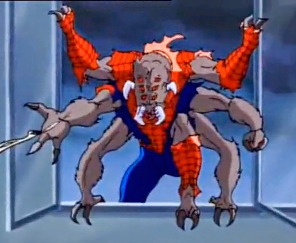
I always liked characters with multiple arms, so that was a start. As a huge fan of spider-man I thought I could go ahead and make the Man-spider; next stage of spider-mans mutation resulting in turning him into a spider like creature. The more I thought about it it seemed more cool and fun to do, so I decided.

I began by gathering lots of reference. My main (and rather only) resource was the 90s Spider-man animated series ,the model is  based on. The "Man-spider" takes place in 2 episodes, six and seven of the second season, so I had a chance to get a lot of good reference.


Before Peter turned into the man-spider, first his body mutated, giving him four additional arms.


Next I did some very quick sketches to think a bit on paper about the character before going into zbrush. Using the reference all the time I did some studies of the character including a spider diagram to lay down my thoughts. For example, his suit is ripped in the neck area, shoulders, forearms because of the increase in size after the mutation. His head reminds me slightly of cows or an alien from the alien movie; Long and wide with strong facial structure. His feet mutated as well, resulting in two toes and sharp claws, with dog like foot structure. Also his finger count changed from 5 to 3.


Next I moved into zbrush to do some test sculpts. First thing I had in mind was to figure out the anatomy for 6 arms.  Looking at the back I made the infraspinatus, Latissimus dorsi, and obliques join with each deltoid , making a flow. Looking at the front each deltoid has it's own corresponding muscle; top deltoid works as it usually does, the middle one joins with the top abdominal muscle to create a similar effect to the chest just like the bottom one with the obliques.


Later on I did some arms studies, which didn't turn out great. However it gave me an idea to make the claws separate instead of making it one mesh.


Wednesday, April 15, 2015

Cinematic Animation

https://gfycat.com/EnchantingFlawedIcelandicsheepdog - link to the gif.

Here is the animation i did for the last part of the game. Boy walks up the stairs, looks at sword, listening to the voice of the demon. I've made all of it myself, and was a lot of fun. First I began with getting the reference of the stairs. Then I animated the hips together with the steps. At first the movement didnt look too natural. So I added some weight behind the steps with some saddle hand and finger movement (Second screenshot).  At the end the boy approaches the altar, slowly to express cautiousness.

I had to clean up some steps as they looked too rushed, too low or like he was sliding. I think It turned out pretty well, however I could clean up the animation bit more, especially the feet sliding in some parts. Also maybe I could extend it further, so the boy picks up the sword.


Boy Animations


Here are some screenshots of the animations i did for the boy.  It was a lot of fun to do, even tho it was my first time animating a character. We were told we could use premade animations, however I didn't wanted to do that, I wanted to learn and make stuff on my own.


 First I began with the Idle animation. I've put him into a relaxed, standing position for start, and went from there. Slight breathing movements by rotating the chest forward and backwards a bit. Then the boy looks around, going back to his loop position. To improve on that I could make it a bit longer. although I like how he behaves, it is too repetitive when it's looping inside the engine. I could just add a bit more frames so he just stands there breathing.


Here is the first jump animation I did. At first it had some hand wave motion, backwards and forward, However I changed it as it looked weird inside the engine. First he gathers strength, then pushes off the ground, to land gaining balance. We haven't used this one, however we used the mid air frames as a falling state. To improve on this animation I think it should be more dynamic when he pushes off the ground.


Here is a take two on the jumping. This one had the same, basic idea; push off the ground, jump, gain balance. However as you can see on the second screenshot it shows more control and stability from the boy as he is in the air. We ended up using this one.  To improve it I could make it more dynamic while he is in the air.


Here is the running animation. Not much talk about in here, I tried to get a good loop, however I didn't manage to get it perfectly smooth. I'm happy with the results though. However I could hide the loop a bit better, and make it look more natural.


I think this is my favorite one. Just a basic walk animation, but this one feels most natural of them all. We ended up not using it at all because of the lack of time. Same as the running animation I could improve it by hiding the loop better.