Friday, April 29, 2016

SlaveDriver, Game Ready Model

This post will be both about the high poly zbrush model and the low poly, as I haven't wrote about it yet. The third character for the Alpha project was originally going to be a cook, or a butcher. He went through a lot of variations and ideas, and I finally decided I will give up on the theme of a butcher. The reason was is that there is a lot of butcher characters, a concept that has been done over and over again, therefore I felt like I would be just copying the same thing once again.

After some feedback, I decided he will be a Slave Driver/King, which perfectly fits in with his appearance;brute, aggressive, scary. The backstory for him is that one day he might have be a slave himself, after freeing himself (or chewing off his hand) he run away, and one day came back for his revenge.


 Different variations
However, even after I knew who he is, I couldn't figure out a good clothing for him. There isn't too much reference out there, so it was quite hard to figure it out.


This is the result I came up with. He has some armor to protect him from potential attacks' spikey shoulders give him bit of a bulky shape, building up his shoulders. Also another thing to notice is the mechanical arm, which in the world of Del Toro would be a very viable concept. Further on I gave him a whip, which was the only way I could think of, of showing he is a slave driver
Overall I wasn't very happy with the results; the clothing didn't fit in, there was something missing from the character.

Beta.
Inspiration for the shoulderpads
Here I decided to jump back into Zbrush and do almost a complete redesign. First of all I knew I have to improve the shoulders, they weren't a final thing anyway. It was one of  not many ocasions when I tried hard surface inside Zbrush, it was quite fun with the us of Zmodeler. After I hade the shoulder pad base, I created a spike brush , inspired by guild wars 2 heavy armor

Quick ideas for new appearance


I was quite happy with the face. The main change it received was eye sockets (and eyes of course). At first I had an idea of him moving around using smell, or tasting the air with his tounges. But in the end I decided it will be better to give him some eyes.
 Here I was trying a sawed eyes concept

Another important change was the leather covering his legs. I had an idea of him wearing a leather of disobeyed slaves to show his status, and to warn these who are even thinking of stepping forward. On top of that I wanted to keep the idea of wearing armor for protection, and gave him a chain mail using nanomesh.

Here is the final result! I'm much more happy with it than the Alpha version,. It has better composition and sense, and still speaks "SlaveDriver"


Next step was the retopology. And quite surprised, It took me just two days for the retopology. No issues there, everything went rather easy. For the chain I used Zremesher, it was probably the fastest way to go about it, I was quite short on time. Also this time I decided to increase the polycount for the head/face. Previous two times I kept behind on the polycount, and thought I will go bit higher this time (for the face that is). The result was great; smoother edges, transitions, and better normal map quality.


I decided to combine the 'socks' and the body to save up on another mesh, it baked out quite well. Another issue I was left with was the chain mail. Basically I gave up on it, having no idea how to go about it. I've tried two methods, one was trying to project the vertex color which resulted in the same way as with the goblin; bleeding alpha map. The other way was creating a custom Chain mail material, which I had left over from the goblin. In this case it looked terrible, resulting in me making it a ripped shirt (which turned out even better than having a chain mail?). Later on I've been given an advice, to treat it more like an environment not a character, meaning to use a tiling  texture for the chain mail. Now it is too late to try this method out, but next time I will for sure, sounds very interesting!

Next was DDO, and it was nothing but buggy, making my textures disappear or appear in a weird way (messing up the layer modes)
DDO
marmoset


In the end, I am very happy with it. It has a better design, and looks like a slave driver even without the whip. If I could change something I would give the chain mail another go, and make the skin a bit more glossy. Also I think the textures could use a bit more work.


For the posing I decided to go simple, I used the Zbrush "super average male" for playing a slave in the scenario. Both got a simple rig and quickly got posed. It needs more work, but I think it gets the idea across! (more at https://skfb.ly/NGvR)


Fortune Teller, Game Ready Model


Next in line was the Fortune Teller. Again, using the same software, Maya, Zbrush, Quixel for retopology and texturing (also fair to mention , Xnormal for map baking). Once again here is the result of the alpha project.  

Fortune Teller, Alpha project result
Fortune Teller getting small improvements before the retopology
With her I didn't have to change much; I really liked the way she turned out at the end of the Alpha stage. Main challenges were once again the strings, as she had few more than the Goblin. Most of  the strings were done by projecting the string texture onto a plane, which turned out better than I thought!

 Just like with the other two models (Goblin and Slave Driver) , I stayed in Zbrush to improve few things, like cloth folds, face features etc.


Here is and early look at the Low poly version. So far I didn't have any issues or bigger challenges with her.

Wireframe In Maya
 Moving on to DDO (Quixel) I had 5x4k Maps once again, Once for the body, jewelry, clothes, hair, Eyes. Most probably I could squeeze the hair uv into one of the other maps, keeping it small (the hair being very dark, could get away with smaller Uvs) 

During the texturing stage I decided to add new tattoos, and facepaint to make her a little bit more interesting and fit in with the rest of her design. I did some research on trival tattoos, paying attention to patterns and shapes, focusing manly on black colour. What I liked about it is that I didnt have to plan it too much; with DDO I could design on the go, and quickly erase if needed.
.Quixel stage went without any problems, except buggy opacity inside ddo. Other than that it was a quick process.

Quixel texturing

One major change between Alpha and Beta stage is the jewelery. I added more rings and bits, and also changed the chaplets layout. 
 The reason is that when posed, they would overstretch, make the arms impossible to move in the real world. I still wanted to keep them, so I went into zbrush, took my custom chaplet brush and redesigned it. In the end I used a plane with normal map&alpha projected onto it. 

Here is the final result (Marmoset). I think it turned out great and stayed very close to the original. With this one I could really practice strings and such, the thing I always struggled with. Early during the retopology process I've got told she won't be able to move her arms from the anatomical point of view, which meant I would have to quickly redo the torso. In the end there was no problem with movement during the posing stage. If I could change something it would be adding more things to her skirt, perhaps coins or amulets. 


Here is what I ended up at the posing stage (once again creating a simple rig). The idea came rather naturally, she already gives a mysterious vibe, dark and atmospheric. Both table and the assets (candles, dice etc.) were textured inside Quixel. Candle flame has an emission texture to it, combined with bloom, creates a nice mood. (more at https://skfb.ly/MMVr) 

Goblin Alchemist-Game Ready Model

Moving on to the Beta project, my aim was to prepare the three characters to be game ready, using Maya for retopology (with a bit of Zbrush help) and Quixel Suite 2 for texturing. In the end I would present it using Sketchfab (https://sketchfab.com/jukkathewalrus) for more possibilities like: Free camera movement, setting up a scene with PBR lighting and so on. However I still tried other renderers like Marmoset, Unity 5, Unreal, Quixel. In the end, I think Sketchfab has the worse rendering out of all of them, thought it is easy to set up and accessible online.

Once again this is the result of the Alpha project; sculpted in Zbrush and rendered in Keyshot. Looking at this I had to analyse and think through how I would go about retopology and texturing. The biggest concern was the beard and the chain mail wrist guards, for a simple reason; I haven't done any models that would have a chainmail, or hair. having that challenge in mind, I proceeded with the retopology.


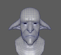
 here is the early stage of head retopology. At first I thought I give the Zremesher a try, seeing it being able to handle topology quite well. Then I would remove unnecessary edges. The issue I had was uncontrollable loop edges, in the end I decided to redo the whole head manually


here is an early low poly version, with normal maps already assigned and baked. Here you can see that the beard is missing, and the chain mail is just a decimated version from Zbrush. Naturally along the way new challenges occured. This time I realised I haven't done, or I've been avoiding doing strings and any kind of ropes in my models; I thought it's time to give it a go. It took me quite a time (still haven't perfected it!) to get the projection right, without weird issues, like black spots on the Normal map. Shoelaces took me the longest. At first being a decimated version from zbrush, then a projection onto a plane; it works great and is much easier than projection it onto a cylindrical shape, however I wanted the shoelaces to have a form.

There is a notable difference between the low poly and the Alpha project goblin. During the Beta project, I received some feedback, saying he doesn't look like an alchemist enough, which I agreed with. Doing some concepts, and sketches I added bunch of accessories to his backpack, adding more to his Alchemist appearance. As he constantly moves around the world, the pot might be helpful to cook potions, leafs could be helpful herbs that could be needed anytime , and so on. I like the new look much more!


 As I said, I did some unity previews, giving me a good idea of in game appearance. I used the blacksmith scene that untiy proved on their website, and I absolutely  enjoyed the scene lighting.


I was still left with the issue of the chain mail and the beard. For the beard I tried various methods. In zbrush i tried placing the cards with a curve brush, which was a good approach, however I confronted issues with uv maps. So in the end I placed the cards manually. What took the longest was getting the texture right, the alpha transparency to look decent; I still think I could have done it better.
For the chainmail at first I tried to take the high poly chainmail from zbrush, with vertex color (black) and projecting it using Xnormal; however the alpha map was bleeding into eachother, overlaping chain mail rings. Next idea was to create a custom material inside Quixel and apply it this way. It turned out OKAY. not too happy with the results, but I had little time left so I moved on.


Here is the final result of the texturing (Marmoset render). I like how it turned out and how close it stayed to the original concept and textures. The character consists of 5x 4k textures , which can be easily reduced if needed. I struggled a bit with deciding how many maps I will need; I ended up with Body, clothing (including the backpack and assets), beard, leafs, and eyes maps.
Next step was posing him and giving him a suitable environment to tell a story, and make him more interesting than just an A pose character.


Here is the posed model (more at https://skfb.ly/MToY). I did a quick rig, nothing amazing, just good enough. Dragging his cart, his home on wheels, with everything he will ever need. The idea for the cart came from his traveling aspect. The backpack isn't enough to carry things like food, heavier equipment, and various potions.
LowPolyInsindeMaya
Sketchfab Model Posed

Unfortunately I didn't quite finish that scene up to a standard I would want to. My aim was to make it look a bit like the Hellboy's troll market (initial inspiration for this project) adding lamps and a paths, couple assets here and there.

Overall I was happy I have proven to be able to take a character from concept to a game ready character, fully textured and presented. If I could improve anything it would be the beard and the chainmail, give them a bit more work and quality. Also, perhaps reduce the maps quantity.


Thursday, March 17, 2016

Zbrush stuff


I came up with an idea of daily sculpts, but then I realized how hard it is in terms of time management. So I decided to do random sculpts as such as often as I could.